Making your (Windows) computer easier to use with a sight problem

This is a set of suggestions and tips for helping you or someone you know with problems with sight to use their Windows computer. It’s probably most useful for a technically-minded person looking to help someone with sight loss but still some vision. Age-related sight loss, for example. If you are completely blind you will need a screenreader and more specialist training.

The focus is on changing Windows settings and free and low-cost software. It’s basically the things I would do if I was round your house trying to get your PC set up to be useful for you.

I’m assuming you’re on Windows 10, which has better accessibility features than previous versions. Windows 8 is just about as good, and Windows 7 is okay, but earlier than that and you really should upgrade.

I start, though, with a couple of hardware suggestions.

Get a big TV or monitor

If you have an HDMI output from your computer (most computers do nowadays) you can plug it into a big television or a big monitor to give you a bigger brighter display. A relatively inexpensive 22″ TV will work fine. You can try plugging your TV in to see how it works!

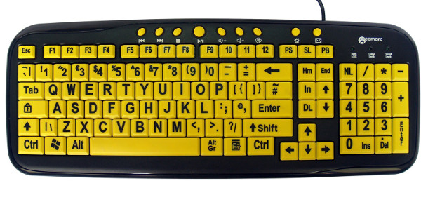
Get a high-visibility physical keyboard

You can buy keyboards with bright big yellow-on-black keys. This will help you find all the key combinations you’re going to be using. For example, from the RNIB Shop:

Black-on-yellow keys and big letters and numbers make this keyboard easier to see and use.

Now on to changing your Windows settings.

Change your display scaling and/or screen resolution

This is surprisingly tricky because there are two settings in Windows that interact.

You can change the screen scaling or DPI (dots per inch). This is in “Start”, “Settings”, “System”, “Display”, “Change the size of text, apps and other items”. Drag the slider left to make things smaller and right to make them bigger.

The Settings, Display dialog that lets you change text size. The slider makes text and anything else on the screen bigger and smaller.

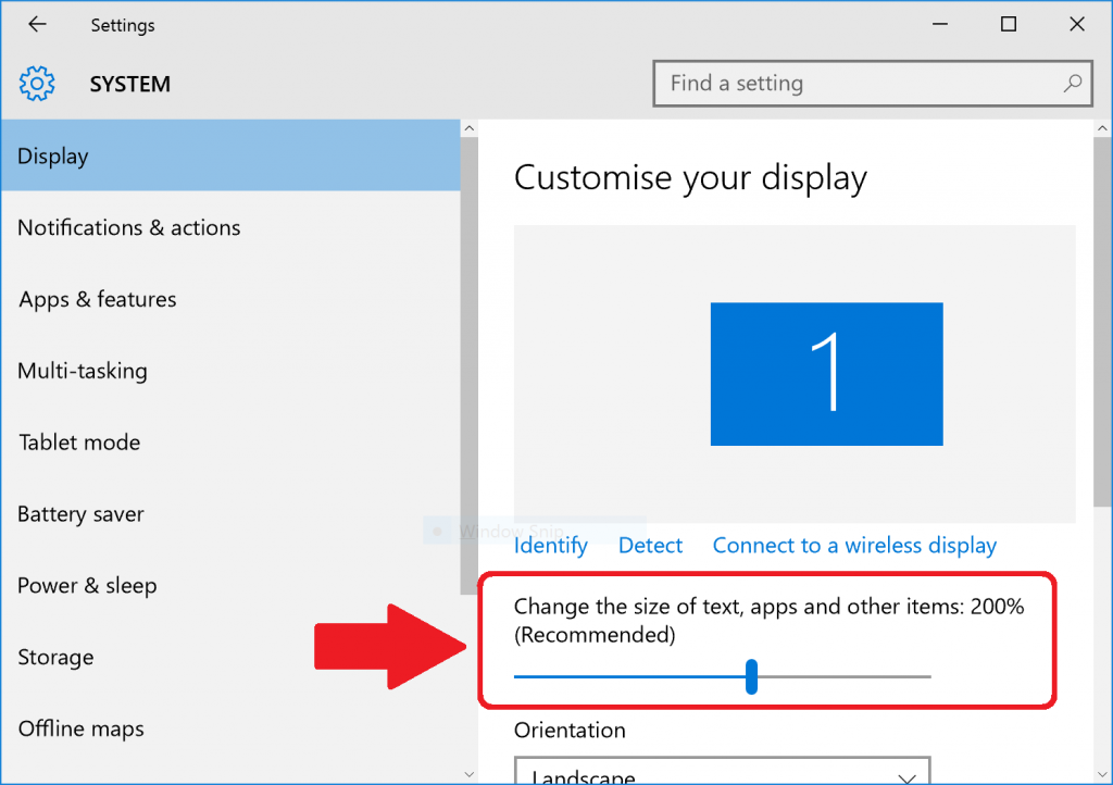
You’ll have to sign out and sign in to see the full effects. You might not be able to drag the slider to make things bigger if you have a low-resolution screen: see “Get a big TV or monitor” above or read on.

Changing the screen scaling or DPI used to work very badly: lots of applications would not display correctly, with overlapping text and missing buttons. Nowadays things work much better. Note that older Windows machines (e.g. Windows 7) won’t let you scale much here so you’re better off with Windows 10.

The alternative to changing the screen scaling or DPI is to change the screen resolution. This is a cruder option, but means every application continues to display correctly. It won’t look pretty to people with good vision, but you probably don’t care about that. This is in “Start”, “Settings”, “System”, “Display”, scroll to the bottom and follow the “Advanced display settings” link, and change the value in the “Resolution” box. The smaller the resolution – the lower the numbers – the bigger everything will get. ScreenResolutionSettingsWindows10

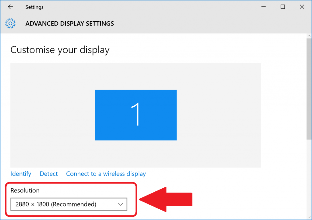
Again, sign out and in to check the full effects.

Finally, things get trickier if you have multiple monitors – like a really big screen plugged into your laptop. You may find some resolutions or scaling levels are unavailable. You could try restricting Windows’ output to just the big monitor you want to use by pressing the Windows key and P together to bring up the Project options, then selecting “Second screen only”. There is more complexity over choosing monitors that I won’t go into here, but “Display” is where you’ll find settings if you look.

Whichever way you do it, some things won’t fit on the screen if you make everything really big. Not much you can do about that.

Make the mouse pointer bigger

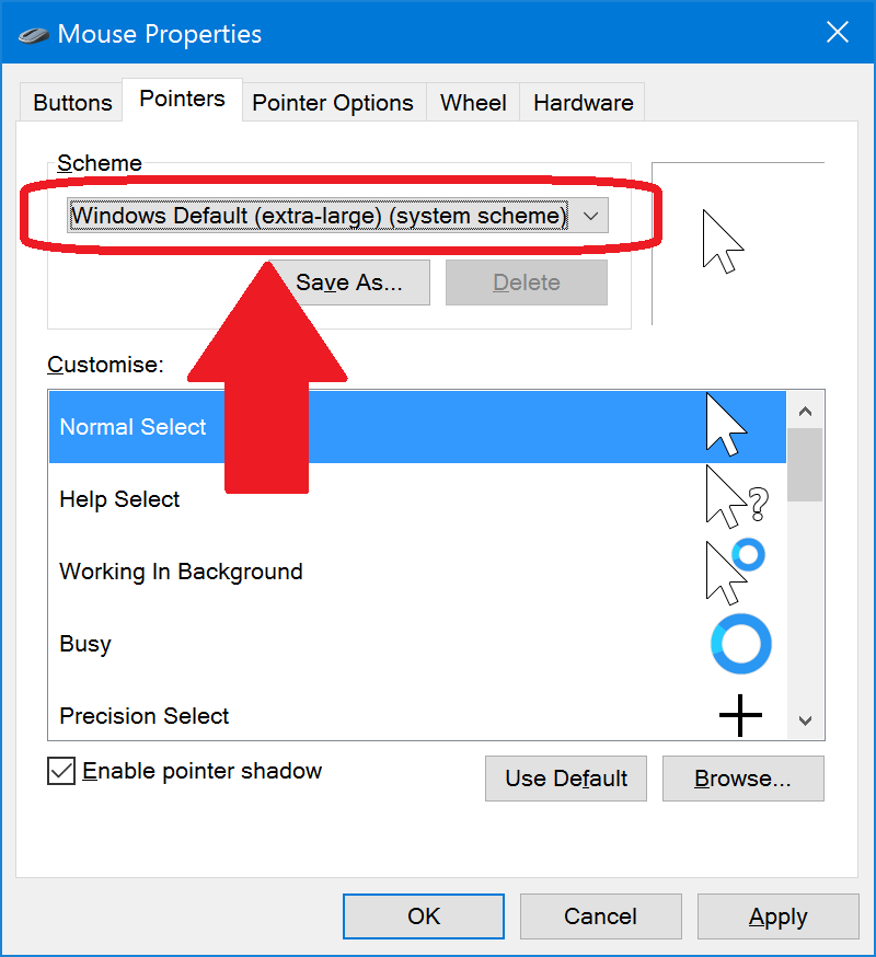
“Start”, “Control Panel”, “Hardware and Sound”, and under “Devices and Printers” you’ll see a link for “Mouse”. Go to the “Pointers” tab and select the drop-down in the “Schema” section. There you will find several schemes labelled “extra-large” that make the mouse pointer bigger and easier to see.

Combobox "Scheme" lets you select a different mouse cursor size. Choose "Extra-large"

Switch to a High-Contrast Theme

These make Windows use more contrasting colours for things like window edges and title bars so you can see them more clearly. You can also make the colour scheme yellow or white on black, which might be easier on your eyes.

You can find the High-Contrast themes in “Start”, “Control Panel”, “Appearance and Personalisation”, “Personalisation”. Under “Change the visuals and sounds on your computer” you’ll find four themes labelled “High Contrast”. Pick one of those to try it.

Click/select one of the themes and you get the results instantly.

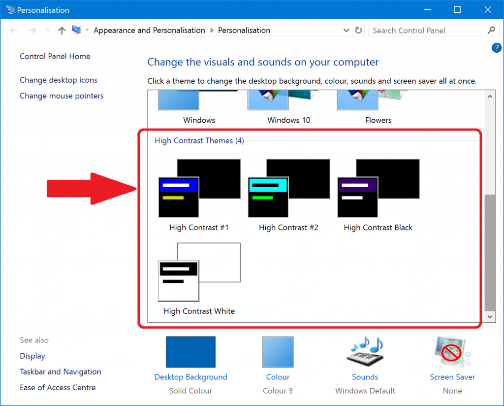
You will find that signing out and signing in again is needed for the full effect of the themes to be observed.

Make some text in Windows bigger and bolder

If you go to “Start”, “Control Panel”, “Hardware and Sound”, “Display”, you will find a “Change the text size only” section. This lets you make various bits of text in Windows bigger: not that many, sadly, but still some.

Use the comboboxes to change text (font) size for items in Windows.

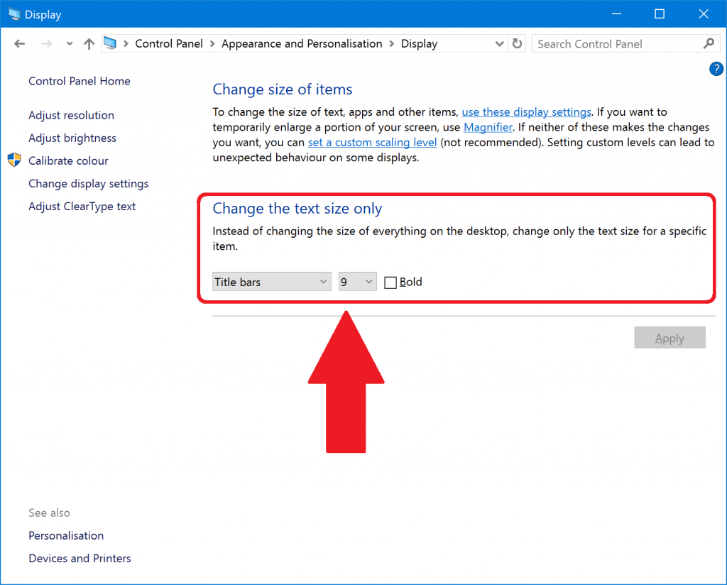
“Icons” does the icons on the Desktop, which is good and bad: bigger text is easier to read, but there isn’t much space for icon text on the Desktop so you will quickly find it gets truncated. Go to the Desktop itself, right-click the mouse to bring up the context menu, select “View” and “Large Icons” to help.

You may find that you have to sign out and sign in to see the changes. You might also have to select a High Contrast theme (see above) to have the changes take effect.

Try using Windows Narrator (Windows 8 and later)

Windows Narrator is the Microsoft free, built-in screenreader. A screenreader is software that reads out the screen. It wasn’t very powerful before Windows 8, but it’s pretty good now, and the voices it uses for reading are better, and it even works in Microsoft Word. You can start Narrator from “Start” like any program, but you can also set it to start when you start the computer.

A particularly useful function for someone who still has some sight is that you can make it speak whatever you point the mouse at. In the Narrator settings, select “Navigation” and check “Read and interact with the screen using the mouse”.

Windows Narrator settings showing how to turn on "read whatever I point at with the mouse"

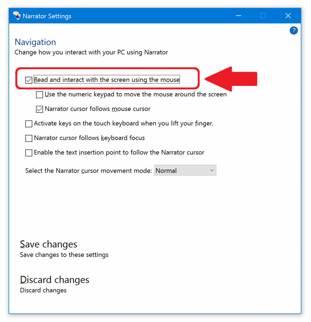
This will let you point the mouse at text and hear aloud what it says. Turn off the other speech options and that will stop it chattering when other things happen so you are not confused. Press the Control key at any time to stop Narrator speaking immediately.

You can also easily use Narrator to read a Word document out loud to you. Click in the Word document to choose where to start. Then press the Capslock key and the M key together. Narrator will read and scroll through the document. Again, Control key stops reading.

Try using Windows Magnifier (Windows 8 and later)

Magnifiers make part of the screen bigger, which sounds like a totally perfect solution until you try it and realise that you get completely lost on the screen really easily. You may find that this is therefore too hard to use: try changing the screen scaling or resolution instead (see above).

You can press the Windows key and tap the Plus key or Minus key to turn on and adjust the Magnifier any time you want, so you could use it for some quick magnification to check something out then zoom back out to 100% so you don’t get lost.

Magnifier does have one additional feature that might be useful: you can set magnification to 100% (i.e. no magnification) and turn on “Turn on colour inversion” to make your screen yellow-on-black instead of the normal black-on-white. This has the advantage, or disadvantage, of affecting absolutely everything on the screen. Selecting a High Contrast theme does not – things like videos in web pages and icons and some applications will retain their normal colours. You will almost certainly not need both High Contrast and colour inversion.

Try using NVDA

Non-Visual Desktop Access is a fully-featured free screenreader for completely blind people. It has loads of features and is completely free with a strong volunteer community. However, it’s a “proper” program for blind people, so it’s focused on being powerful but will require some work to learn it – notably the shortcut keys you use to get around.

Try using WindowEyes

This is not a free piece of software. However, Microsoft has done a deal with the makers of WindowEyes, Ai Squared, and if you have a copy of Microsoft Office you can get a free copy of WindowEyes.

WindowEyes is a fully-featured professional screenreader and magnifier, so is more powerful and have more features than Narrator or Magnifier:

I hope these suggestions are helpful! Let me know if I’ve missed anything obvious out.

Additional Notes

  • If changing the screen scaling or DPI works for you but you want things a bit bigger than the slider allows, there is a second place to set the screen scaling or DPI. “Start”, “Control Panel”, “Hardware and Sound”, “Display” has a “Change size of items” section. In there is a link to “set a custom scaling level”, which has a drop-down combo box with more scaling options than you get from the Settings option. This is more likely still to break older applications, but do try it out. On my machine, I can go up to 500% here but only 300% on the Settings option.
  • You can also check the box “Enable pointer shadow” in the Mouse settings to give your mouse pointer a tail as you move it, which again makes it easier to find on the screen: just wiggle it and spot its tail.
  • You can also buy stick-on large bright letters and numbers for your existing keyboard if you prefer not to buy a high-visibility one.

Updated BBC Live Radio

A simple update to BBC Live Radio today, to version 3.2.0, so three radio stations that haven’t worked for a while now work again:

  • BBC World Service
  • Classic FM
  • National Public Radio (NPR)

Of course, two of these aren’t BBC stations, but never mind! What NPR and Classic FM have in common is that the URLs change relatively frequently, which breaks my code – I’m not using a documented, supported API, I’m just finding the URL by investigating the website and coding it in. It’s a pain to maintain, since I don’t know they are broken until someone tells me, then I have to go and fix them. Still, because people tell me, I know people use it, so there we are.

The BBC World Service one is more interesting. It also exists in the official BBC API, but doesn’t seem to work correctly. So I’ve found the URL by searching and put in that working one. I know the World Service is a bit of a separate part of the BBC, and I know the Internet services provided by the BBC have been stitched together gradually over many years from my conversations with BBC engineers going back fifteen years. So I suppose this simply represents this internal division.

Both BBC Radio programs now updated, including Windows XP support

Tonight I’ve updated BBC Live Radio to version 3.0, and I believe that it now works with the new BBC Radio live streams for Windows XP and later. Last week I updated BBC iPlayer Radio to version 9.1, and I believe that this now works for playing 7-day catch-up radio programmes using the new HLS format, again on Windows XP and later. Thanks for bearing with me, and let me know of any problems you find.

Here’s some notes about the new versions:

  • The BBC Live Radio programme is now using the new HLS streams for Windows 8 and later. Windows 7 and earlier won’t play these streams, so it falls back to the ShoutCast MP3 streams. These will be turned off by the BBC in 2016, on current plans, so Windows 7 and earlier will break again.
  • In BBC Live Radio at present I simply pick the first HLS stream available, which is probably not the best choice (non-optimum bitrate, or wrong international/not international version, or whatever).
  • The BBC iPlayer Radio programme simply converts the downloaded AAC file to MP3 to play it, using FFMPEG, which can take a little time, and there is no progress indicator yet. Users will probably think it has hung, but give it a little time.

Update to BBC iPlayer TV 7.3 restores Audio Described category

New BBC iPlayer TV version 7.3. At the beginning of November 2014 the BBC removed various data feeds from their website, including the one that gave the list of TV programmes available through BBC iPlayer with Audio Description. This meant that all the categories in the WebbIE BBC iPlayer TV programme broke overnight.

There’s no sign of the BBC restoring them, so I’ve removed all the categories in BBC iPlayer TV except for Audio Described. For Audio Described, since it’s so popular, I’ve hacked some code to pull the available programmes: it takes a little while to load, and you don’t get as much detail, but it works.

Other minor changes: I’ve added a Flash item to the Help menu that links straight to the Adobe site so it’s easier test/install Flash: Flash is the number 1 problem for users in using iPlayer TV. I’ve also added a TeamViewer menu item for easy technical support, simplified the UI for screenreader users tabbing around, and fixed turning off the voice that announces what is going on.

ChromeVox browser extension

ChromeVox is a self-voicing browser extension (add-in) for Google’s Chrome browser. It’s designed by T.V. Ramen, the guy behind emacspeak.

It’s optimised for Chrome OS, at present (Google’s operating system that basically just gives you the Chrome browser as your desktop), probably because it is the only plausible accessibility story on Chrome OS for blind people, but it works fine on other systems.

You get a bunch of hotkeys that let you navigate around the page and a synthesized speech voice. The functionality is pretty geeky: if you’re comfortable with the idea that a web page is a hierarchical arrangement of nodes of different types, then you’ll fit right in. However, if you’ve already learned your many hotkeys for your screenreader to use Firefox or Internet Explorer, then you’re probably not going to find anything more useful in ChromeVox.

It’s maybe most interesting for Thunder Screenreader users, who can use ChromeVox with Chrome to give them the advanced geeky webpage navigation features previously enjoyed by JAWS or NVDA users, but can still fall back on the simpler Thunder features in Microsoft Office or WebbIE – and all for zero cost, since both Thunder and ChromeVox are free.

Demonstration of a screenreader end user browsing the web

If you’ve never observed an end user using assistive technology, or you’re familiar only with your own AT, it can be a real surprise how people operate when browsing, mailing, word processing and so on. While nothing can beat a session with an end user in action talking you through what they’re doing and responding to all your “but WHY do you do it THAT way?” questions, here’s the next best thing: a video of a screenreader user, Bruce Maguire, employing a refreshable Braille display (rather than synthesized speech) to browse the web:

There is also a full transcript of Bruce’s presentation. (Courtesy Roger Hudson at Web Usability)

HTML Tables: how fashion affects Assistive Technology

“I like web pages with frames” a screenreader user told me in 2003. “They make it easy to differentiate the navigation bar and the content pages.” Back then, frames were well into their decline as a popular HTML technique, replaced by single-file HTML pages using TABLE elements. Everything was wrong with frames, including problems for blind people – confusing back and forwards, problems of positioning the focus and so on. The new TABLE layouts were much better, right?

Well, frames are pretty much dead as a design tool, and no self-respecting web developer would be seen dead using them. In fact, we are now going through the process of ditching the successor to the frame, using the TABLE element to lay out web pages. We’re moving to CSS-based pages. And arguments about accessibility for blind and screenreader users are being made in support of this shift (e.g. “Tables make life hell for those using screen readers” or “Tables Aren’t as Accessible” or “make your sites more accessible to all viewers and user agents” to give you the top three Google results for “layout tables are bad”.) There’s even a Web Content Accessibility Guideline, mandating what an “accessible” website should do, that says “5.3 Do not use tables for layout unless the table makes sense when linearized.

Is this true? What impact will the change to CSS have on blind and screenreader users compared to the current TABLE-based world? And what does it mean in terms of how we use arguments about accessibility to make decisions about technology?

Tables versus CSS: the technical details

Here’s why the use of TABLE elements is irrelevant to screenreader users and possibly even better than the CSS future.

Reason 1: Screenreaders handle layout tables just fine.

Tables for layout are the de facto standard, used on literally billions of web pages for over a decade. Screenreaders therefore handle them just fine. They’re a solved problem. Screenreader manufacturers do not generally insist that, for the sake of semantic purity, their users are inconvenienced by hearing extraneous and incorrect table formatting information as they browse the web.

Reason 2: Tables restrict designers to simpler layouts

Using tables means you have to segregate your page into relatively static and simple rectangles. The order of the content as it is encountered by the screenreader user has to reflect the order in which you code it, which means that navigation bars – usually left and top – generally come first. This is helpful for blind users because they can become used to “all the rubbish at the top” and come up with their own techniques for handling it, and the content when they do find it tends to be strictly linear and thus easier to use.

Compare this to PDF, where a page can hop about in terms of layout and floating text boxes and other things that confuse the all-important reading order. This kind of visually-effective design is much easier in CSS, and so will increase the complexity of web pages and hence decrease their usability for screenreader users.

CSS also permits much more variation in web page appearance during the page’s lifecycle, so suddenly you can do complex things like pop-up messages in CSS. Very Ajax, very hard for screenreaders.

Reason 3: CSS doesn’t give you any more semantics than layout TABLES.

It’s not like using CSS suddenly lets a screenreader user spot a search box, navigation bar or main content. CSS elements are arbitrarily named with non-standard tags. HTML5 might fix things – it has extra elements like NAV for navigation bar, which might actually be useful – but that’s going to be a long way off.

CSS3, of course, has a layout table anyway, so the Next Big Thing may well be – scrapping CSS for tables!

Reason 4: The implicit alternatives are “broken TABLE use” versus “utopian semantic web use”.

The latter isn’t going to happen. Most data is in PDFs or CVS. Everything else is in the tag soup of web pages. Maybe Wolfram Alpha will pull it out, but that gives one central point of reference – not arbitrary tables. Google gets information from links, not from page semantics – page semantics are too easy to game, as you’ll know if you tried using Alta Vista in 1999.

5 It should be easy to use heuristics to detect real data tables. They’ll need the extra semantics anyway.

The fact that content is laid out in a grid doesn’t really tell us that much. What do the columns mean? What’s the relationship between each item in each cell? Well, HTML gives us some extra elements which are actually useful – CAPTION, TH, SUMMARY. So a real data table is almost certainly going to use them.

Which gives us a convenient heuristic to differentiate data tables from layout tables: if it has the additional semantic elements then it’s a data table, otherwise it’s a layout table. So are we really missing semantics from the mis-use of the TABLE tag, or are we just missing actual non-layout TABLE elements from the Web?

7 TABLEs are relatively consistently and widely supported.

This means that people with alternative browsers are more likely to make sense of your layout, and the DOM for your access technology is simpler to parse and use. Known, older technology has better support from AT vendors, who always lag a few years behind, and from trainers and users and experts who need to build up techniques and approaches for new ways of doing things.

8 TABLEs scale better when you zoom the text.

CSS coders make assumptions: TABLE coders make assumptions. CSS assumptions don’t include people needing to zoom pages 400%, 1000% to read them. TABLE assumptions don’t include that either. However, because of how they are implemented in every major browser, and because they are simpler and lay out more simply, tables work much better when you zoom them up. Sure, you get a side-ways scrolling bar, but you don’t get overlapping text and columns squeezed to one character and rendered entirely unreadable.  Try it yourself with a table page and a CSS page.

6 Finally, CSS is harder than TABLEs: it’s a status symbol. The wasted time producing the same visual effect could have been used for accessibility.

First there were FRAME elements, then TABLE elements, now CSS. Professionals need a way to argue to their clients that their work is better than others: the ability to use hard-to-implement CSS is a form of display, a status symbol like a peacock’s tail. “Choose me, I can do this really hard thing! That means I’ll do a really good job of your site!”

What this all means for screenreader users and AT practitioners

If TABLEs are better than CSS, then what’s going to happen next? Can we fight it?

No. Let’s be honest: CSS is in, and layout tables are out. There is no way we’ll go back to TABLE use. The lesson to learn, therefore, is not that tables are better or worse. The lesson is that fashions and politics apply to coding and technology as much as they do anything else. Don’t believe the hype.

What we have to do is try, this time, to not drop the ball. CSS is part of making the browser environment a fully-fledged operating system, which means vastly increased complexity for the web page over the static text-based document of a decade ago. There will be decisions made about technology and support for screenreader users of these pages a-plenty: don’t leave them until the application is finished, because it never will be. The web moves too fast. Investigate HTML5 and WEB-ARIA and using your site without a screen or a mouse or the ability to click-and-drag.

Finally, coming full-circle back to our layout TABLES: if you want to help screenreader users, don’t waste your time replacing TABLE layouts with CSS. Wait until HTML5, and add the existing useful page semantics in HTML4, especially for your data tables. And make you funky AJAX sites work somehow if you turn off Javascript and pull out your mouse, and you’ll be doing the Right Thing.